Hey everybody, today this will be a very fast tip, but as always, an important one!!
When you are web designing, keep in mind some principles about color and contrast:
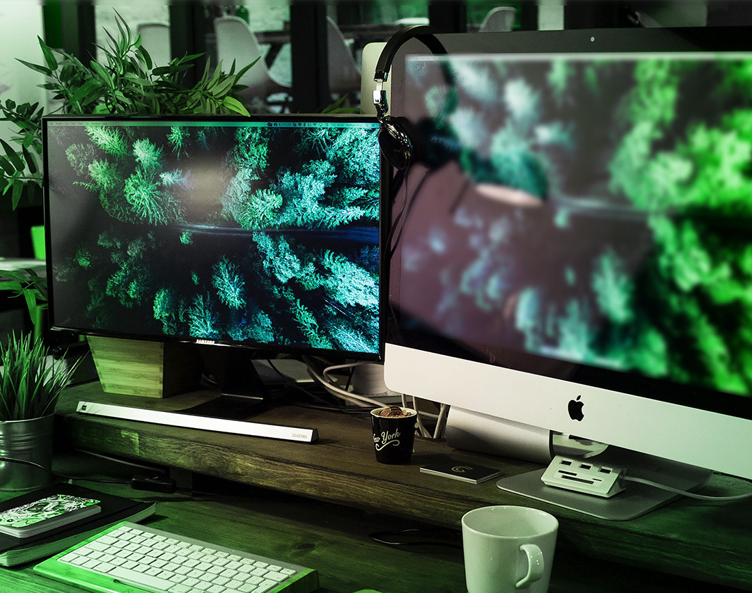
- Each monitor has different settings, so avoid very weak contrasts (such as white and very light gray for example) because if the monitor has too much brightness or low contrast, these colors will blend in. So be aware with that.
- Always prioritize information! If you want to overflow brightness and contrast safe boundaries, do that just on visual elements, but keep the information safe!
- Remember that your website will be visited by computers, notebooks, TVs, projectors, tablets and smartphones (maybe even by your refrigerator, lol) ...
- If it's possible, try to reduce brightness and contrast of your monitor, or even test on a "cheap monitor" before moving to the next page of your layout.
Well, that's all folks !!!
Did you like the tip? Do you have any questions or suggestions? comment below! ;)


